KacePack — Brand Iconography System
About the Company
KacePack™ is a packaging company that began collaborating with cannabis brands on packaging solutions in 2017. By 2018, the company reached a key milestone with the successful launch of its initial flower jars.
In 2021, KacePack set out to evolve its brand identity. The goal was to move beyond being seen solely as a cannabis packaging supplier and reposition itself as a thoughtful, conscientious packaging brand. This shift focused on creating products that not only met regulatory requirements but also redefined freshness and quality—pushing beyond conventional industry standards.
Design & Solution
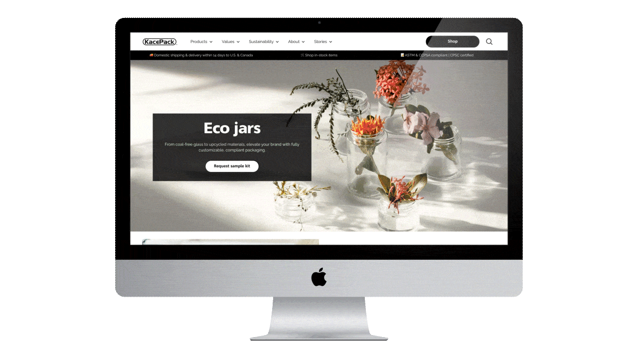
I collaborated with Good Sauce Agency, which led KacePack’s brand refresh, to design a comprehensive iconography system. The objective was to create a set of icons that supported the new brand direction while integrating seamlessly into a photography-led web experience.
Because the website prominently features modern, vibrant photography, the iconography was designed to function as subtle visual cues rather than dominant graphic elements. The system focused on clarity, restraint, and balance—ensuring the icons complemented the photography and reinforced the brand message without competing for attention.