eBay Iconography Refresh
Challenge
At the time, eBay did not have a unified iconography system. Icons were created by different teams and varied in style, weight, and structure across products. This inconsistency made the experience feel fragmented and difficult to scale across platforms and use cases.
Solution
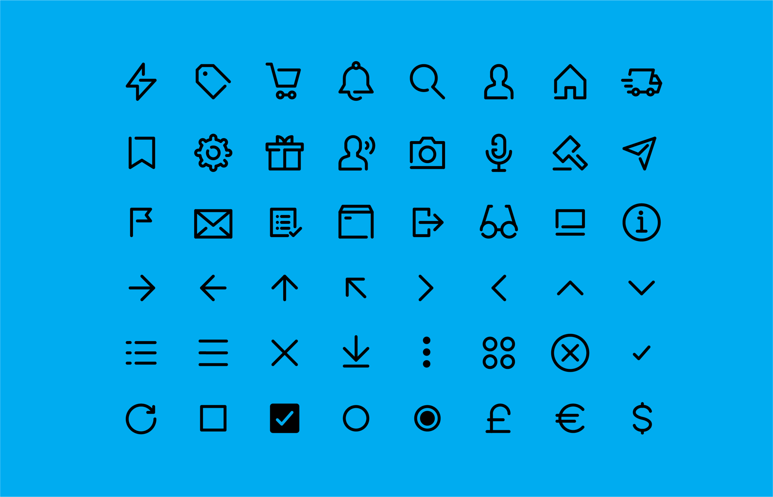
To address this, I designed a unified iconography system that emphasized clarity, consistency, and scalability. The refreshed icons use a continuous line style to represent a complete, end-to-end experience while maintaining visual cohesion across the product.
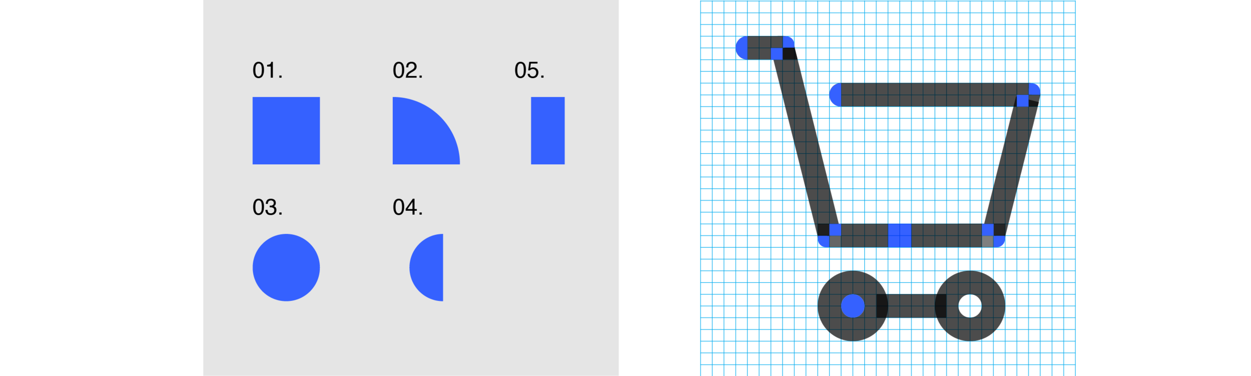
Icons were built on simple geometric foundations, using circles and squares divided into halves or quarters to create a flexible but consistent structure. A minimum 16px grid, 1px stroke weight, and 2px spacing between elements ensure legibility and allow the icons to scale cleanly across sizes and contexts.
Result
A systemized icon set that brought visual consistency to eBay’s products and established a foundation that could evolve over time.